Colour and Lighting
Lighting Considerations
Colours can evoke wonderful feelings and enhance your living space. We at PARA want to help make your house a home through the proper use of light and colour. Without light, there is no colour.
Detailed Information on lighting conditions
Colour is everywhere and everywhere we turn, we are making colour decisions. There is no such thing as an ugly colour. Colour becomes unattractive to the eye if it is used incorrectly. So where do you start in the decoration of your room? A proper floor plan will help pull all of the pieces of the room together. Work from the floor up. Costly mistakes can be avoided through proper planning.
Remembering that your furniture doesn’t have to line up against the walls, define your focal point – the centre of gravity in a room – and place your furnishings around it. Create a comfortable conversational grouping – perhaps in the winter it could be around a fireplace, in the summer around a window with a view.
Once your use of space is decided a lighting plan is next. To see how colour is going to react in your room, it should be viewed in the daylight under natural light and at night under artificial light. The colour of paint and fabrics can change drastically. This process is called metamerism – which means the characteristic of colour to appear as one colour view in one light and another colour view in a different light.
Daylight at sunrise and sunset is warm in feeling, while daylight at noon can be cool in feeling. Artificial light is either cool, going towards blue or warm, going towards red. Incandescent light is warm and flattering where as fluorescent lighting usually leans towards the cool spectrum. This tends to be clear light and virtually shadowless. Halogen lighting has a strong blue spectrum, which works well to enhance white, greys and blues. A halogen lamp will yellow if it is on a dimmer switch. Candlelight and light from a fireplace is called lighting by combustion – a feeling of warmth and should be used as often as possible.
Work with all three levels of lighting to create mood in your room and meet your needs.
To have a good balance of lighting in your room, you need the three phases of light. Work with all three levels of lighting to create mood in your room and meet your needs:
1. Primary Lighting – llight from the ceiling, giving general illumination.
2. Secondary Lighting – task-oriented lighting, lamps for reading and/or lighting under the kitchen cabinets.
3. Mood Lighting – a light source coming from the floor up. They can be placed behind trees to create shadows giving a feeling of mystique.
Good lighting will occupy a space without obstructing it. Lighting can change the size of the room, alter the mood and lessen tension and headaches.
Colour Considerations
Now colour can be added to your floor plan. As all rainbows are not the same, neither is how we view colour. The way we see colour is how the brain interprets it. It doesn’t matter how accurately a scientist measures colour and the colour of light, in the end your eye and your brain make the final decision. Everyone sees it differently.
Questions you should be asking yourself are: How do you want to feel in your room? How does the selected colour effect the rest of the house? What is “in” and do I want to be trendy? Will I get tired of this colour? What if I hate it? And so on…
Nothing evokes emotion faster than the “wrong” colour or a colour you hate.
Warm, sunny, happy, cozy and safe. If this is the feeling you’re after, then the warmer colours will produce that feeling. They are yellow, orange, red, violet, brown and cream family.
The warm colours tend to be stimulating in nature making your room visually appear smaller and warm. Rooms facing north or east work well in the warm colours. Rooms facing south or west may feel too “hot” with warm colours.
Wood is a colour as well. If your wood pieces or kitchen cabinets are looking tired, the warmer colours will play them down. They won’t be noticed as much.
If you want to feel sophisticated, elegant, rich and living in a larger space, the cool palette will create that feeling. Blues, greens, black, grey and whites will expand space, enhance the look of wood and give an elegant look.
Three Categories of Colour
In a room, colour is broken down into three categories:
1. Primary – which take up approximately 70% of colour in your room. The main wall colour for instance
2. Secondary – which is about 25% of colour. This is the colour of larger objects, such as furniture and cabinetry.
3. Accent – which is about 5%. Competition of colour doesn’t work when creating a harmonious colour scheme.
Good use of colour should be balanced, flowing and not jarring. If you decorate with bold, high contrasting or shocking colours, you will tire of them faster. Strong, bold colours work well in rooms that aren’t used often.
When re-decorating your room – once you have your floor plan and colour selected then it is time to proceed. Don’t panic or get scared – you have a plan and have thought it through! A half-decorated room can be described as half-dressed. Finish it and enjoy. Your feelings are normal, but if you lose your confidence, the room will never get done.
The definition of good taste is when all elements of design are working to create a harmonious feeling. When you create good design in your room – you will live with it longer and be happier in that room.
Colour is here to stay. Relax with it, understand it and use it.
Colour Theory
Colour Planning and Colour Schemes
Colour planning combines different colours in a manner that will create an ambiance in a room or setting. There are three steps in creating a colour scheme:
1. Determine how many colours are needed to create the mood you’re trying to achieve in the room or setting.
2. Select a dominant colour from which to build. Traditionally, the wall colour is the most obvious colour in the room or setting.
3. Select the other colours in the scheme according to one of the four colour relationships listed below. These colours can be used to paint doors, trim cupboards and to highlight architectural details.
Monochromatic Colour Schemes
These colour schemes will give a harmonious, elegant, and understated feel to any room. Simply choose your dominant colour or hue and then select other colours from the same colour family or stripe chip.
Related Colour Schemes
Selecting shades from groups of colours which lie beside one another on the colour wheel give a more calming effect than the complementary colour scheme and a richer feel than a monochromatic colour scheme. Select colours from colour families that lie directly beside one another on the colour wheel.
Complementary Colour Schemes
Many classic or visually striking settings can be created through the use of complementary colour schemes. By selecting colours that lie directly across from one another on the colour wheel, the best of each colour is brought to life.
Split Complementary Colour Schemes
Also known as near complements, these colour schemes are for those who demand a more adventurous colour palette. Select a dominant colour and then select colours from families to the left and right of the complementary colour. They are great for layering within a faux finish, or simply to add more colour to a room.
The Colour Wheel
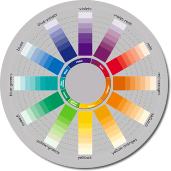 The colour wheel displays the colours of the spectrum arranged in a wheel. It is a great tool to use when you’re in the early stages of planning your decorating project because it allows you to select colours in harmony by following basic decorating principles. PARA’s colour families are found in the centre of the wheel. Remember that the colour wheel does not represent actual paint colours, it simply identifies colour families. Click here or on the image to the right to create a colour scheme using the colour wheel.
The Language of Colour
To help you describe your colour directions, the characteristics of colour are listed below:
HUE
Is the colour family. It is the relative position of a colour to the other colours on the wheel. Violet for example.
VALUE
Is a colour’s lightness or reflectivity as measured against a gray scale from white to black. The higher the Light Reflectance Value (LRV), the more reflective the colour.
CHROMA
Is the vibrance, intensity or purity of a colour. As a colour moves away from gray, it becomes brighter.
TINT
Is a colour that has been lightened by the addition of white colourant or use of a lighter colour formula
TONE
Is the neutralization or ‘graying of a colour’ by the addition of colourants.
SHADE
Is a colour that has been darkened by the addition of black colourant.
NEUTRAL COLOURS
White, black, gray and colours containing a significant amount of gray.
COLOUR AND LIGHT
The appearance of colour is reliant on light. All light sources from electric light to daylight have different spectral properties that affect the appearance of colour. Metamerism is a term used to describe the common colour phenomenon of the change in a colour’s appearance when viewed under different lighting conditions. This is why it’s important to view the paint samples under the lighting conditions where the paint will be applied.
Psychology of Colour
Psychology of Colour
The power of colour is something that most people are unaware of – in fact, few are unaffected by it. It is quite important that we live with the colours that best suit our personalities so that we can enjoy a more contented and healthier life. Colours affect people in many ways, depending upon one’s age, gender, ethnic background or local climate. Certain colours or groups of colours tend to evoke a similar reaction from most people – the overall difference being in the shade or tones used. Warm colours include Reds, Oranges and Yellows and create a mood of excitement & warmth, stimulating activity and creativity.
Cool colours have passive, calming qualities that aid concentration and can create a mood of peacefulness and tranquility. Cool shades include Violets and Blues. Green can be either warm or cool. When it’s influenced by yellow, it becomes warm and when it’s influenced by blue, it becomes cool. When choosing colours, it is also important to consider the effect of the lightness and darkness, or value of colour. Lighter colours tend to be more active, and deeper colours tend to be passive.
So by simply using colour, you can liven the mood or quiet it as well as add warmth or coolness in a room. To ensure colour harmony, choose your colours under the lighting conditions where they will be applied.
For more information about colour relationship, please refer to PARA’s Colour Planning Guide.
Colour Planning Guide
WARM HUES
Warm colours create a mood of excitement & warmth, stimulating activity and creativity.
RED – Energy, Passion, Power, Excitement
ORANGE – Happiness, Confidence, Creativity, Adventurousness
YELLOW – Wisdom, Playfulness, Satisfaction, Optimism
COOL HUES
Cool colours have passive, calming qualities that aid concentration and can create a mood of peacefulness and tranquility, reducing tension.
GREEN – Health, Regeneration, Contentment, Harmony
BLUE – Honesty, Integrity, Trustworthiness
VIOLET – Regalness, Mysticity, Beauty, Inspiration
NEUTRALS
Neutrals are great for adding stability and balance in a room. They include white, black, gray and colours that contain any significant amount of gray.
2021 PARA Paints – Your Home Canadian Style – Accessibility Statement – Terms of Use – CA Supply Chains Act – Privacy Policy – Do Not Sell or Share My Personal Information

